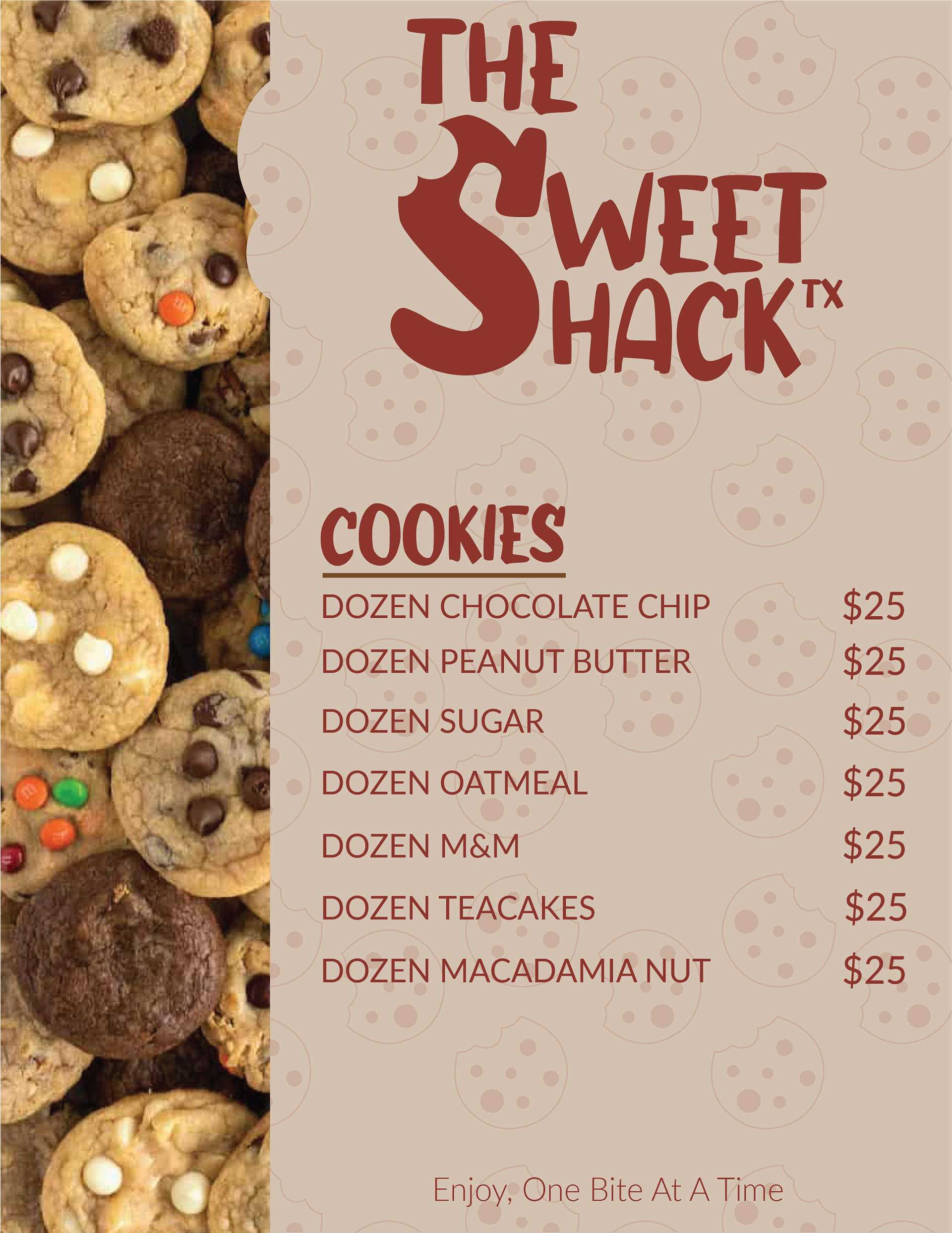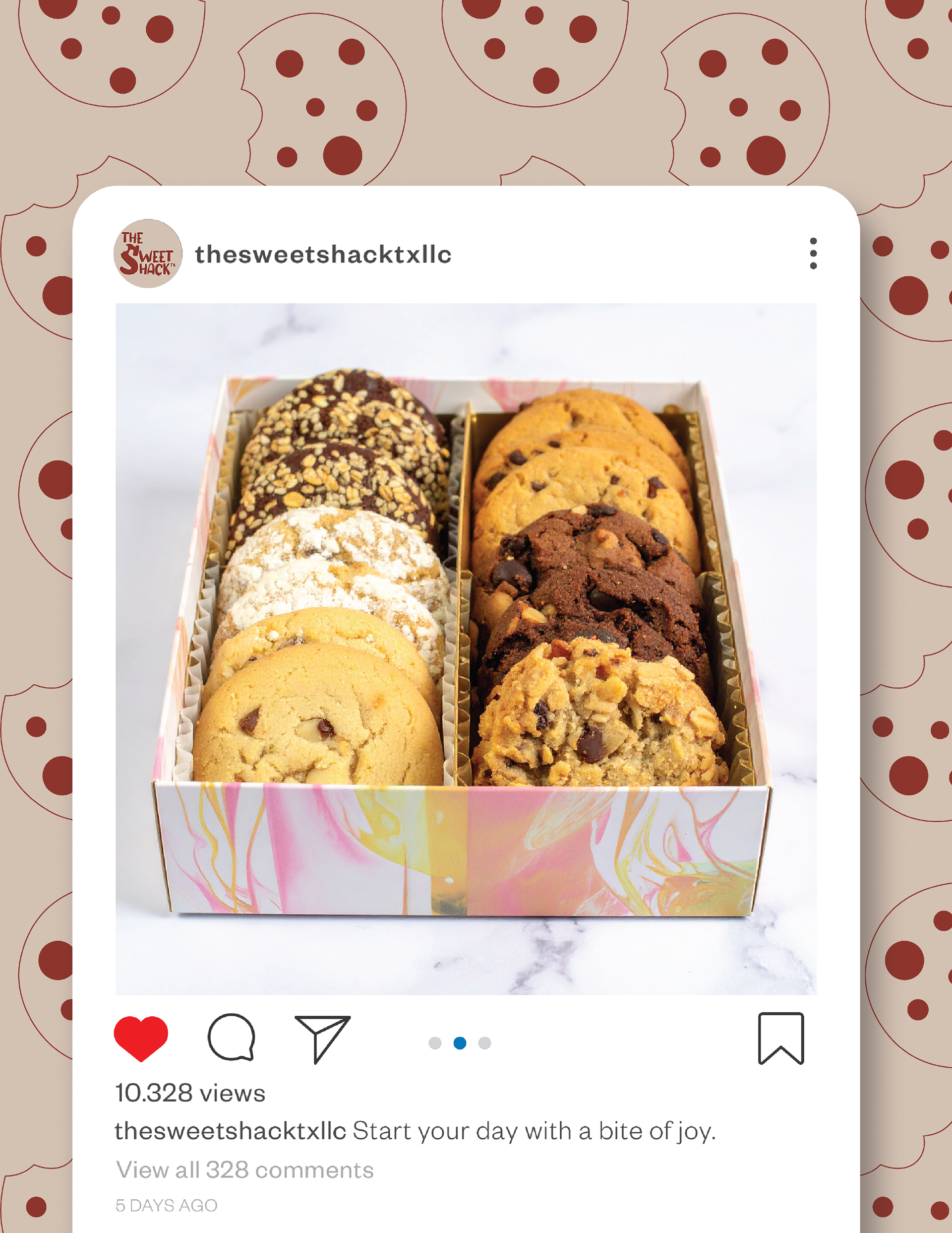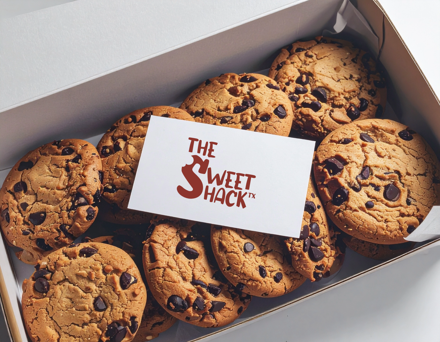

High-quality sweet treats that are perfect for sharing or enjoying all to yourself.
About the project
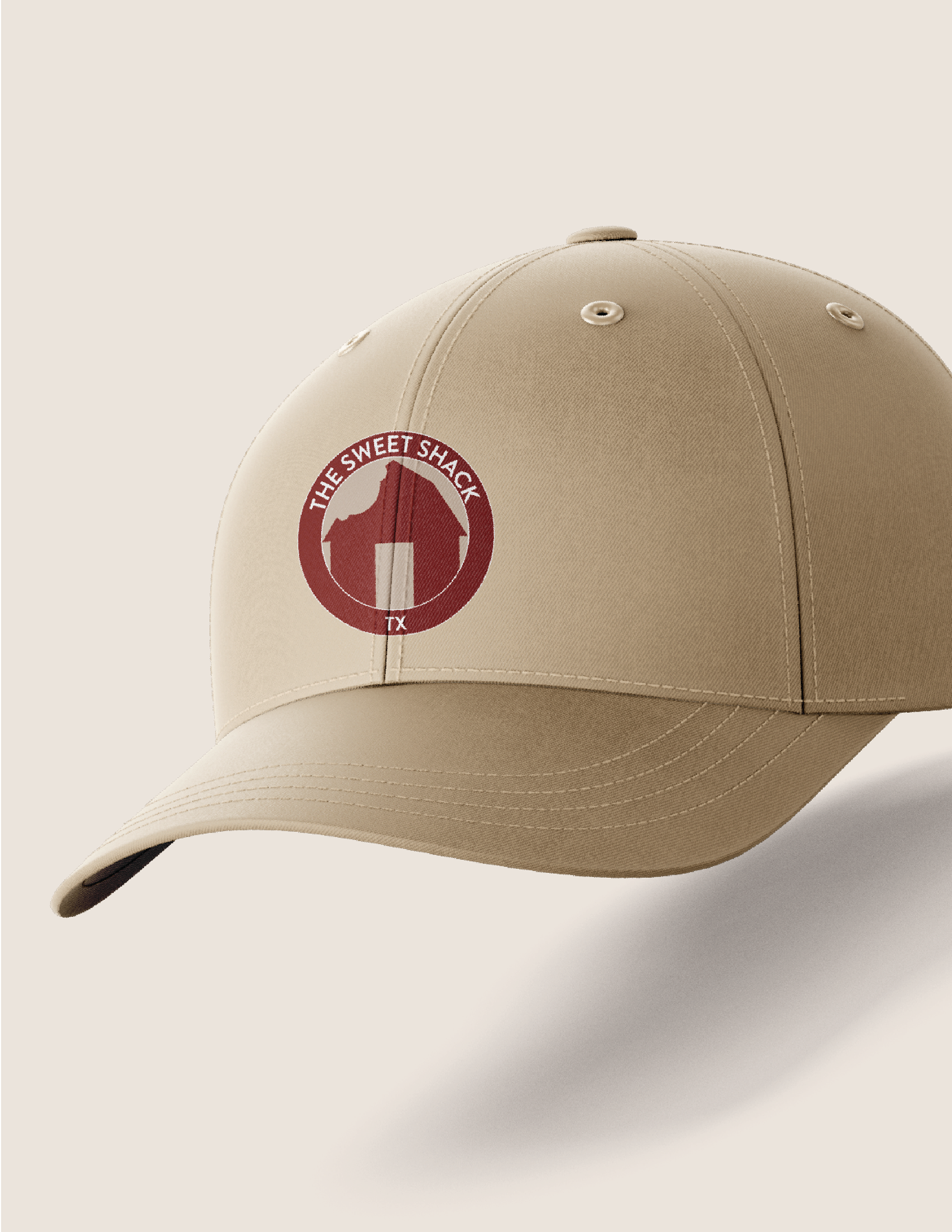
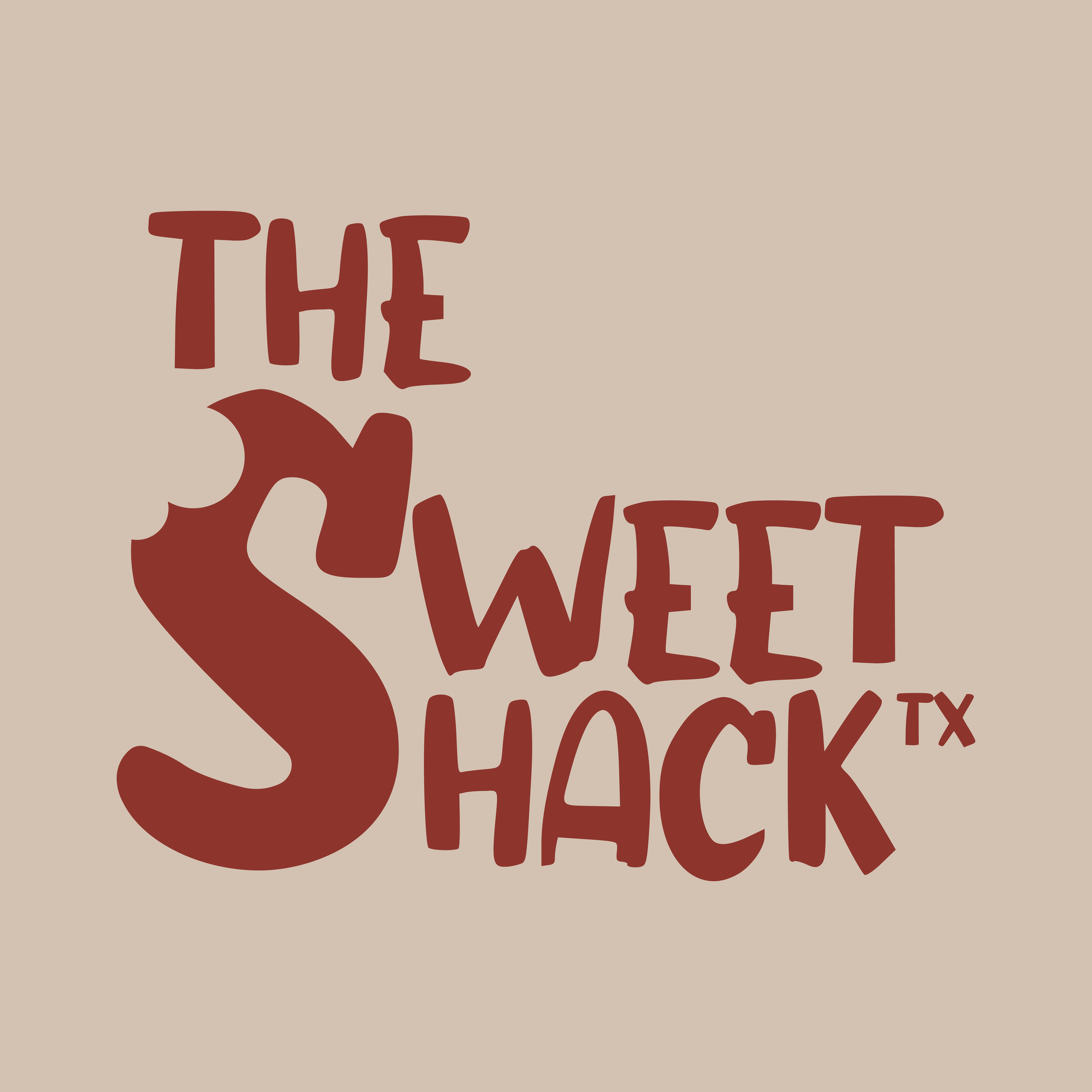
The Sweet Shack TX logo was created through a playful, brand-centered design process. Inspired by the bakery’s focus on homemade cookies, the design uses bold, hand-drawn lettering to capture a warm, inviting feel.
The oversized “S,” complete with a bite mark, instantly connects the logo to cookies while serving as a memorable focal point. A stacked layout keeps the mark compact and versatile, while the deep red-brown color paired with a soft beige background evokes the richness of chocolate and the warmth of baked goods.
The result is a logo that feels homemade, fun, and indulgent, perfectly reflecting the brand’s generous, Texas-sized sweetness.